A potential customer lands on your e-commerce store, ready to buy. They browse for 30 seconds, can’t find what they’re looking for, and click away—taking their wallet with them. Sound familiar? You’re not alone. Poor navigation is the silent killer of online sales, with studies showing that 94% of users cite easy navigation as the most important website feature.
After designing and optimizing hundreds of e-commerce sites at Weblta.com, I’ve discovered that exceptional navigation isn’t just about pretty menus—it’s about creating an intuitive pathway that guides customers effortlessly from browsing to buying. Today, I’m sharing the battle-tested strategies that have consistently boosted our clients’ conversion rates by 35-50%.
Table of Contents
- Why E-commerce Navigation Makes or Breaks Your Business
- The 7-Second Rule: Your Navigation’s Make-or-Break Moment
- Advanced Navigation Strategies That Separate Winners from Losers
- Common Navigation Mistakes That Kill Conversions
- Measuring Navigation Success: KPIs That Matter
- Your Next Steps: Implementing Navigation Excellence
- Transform Your E-commerce Navigation Today
Why E-commerce Navigation Makes or Breaks Your Business
Before diving into the how-to, let’s understand the stakes. Amazon’s success isn’t just about product selection—it’s about making finding products feel effortless. When users struggle to navigate your site, three critical things happen:
- Bounce rates skyrocket (the average e-commerce bounce rate is 47%)
- Cart abandonment increases beyond the already staggering 70% industry average
- Customer lifetime value plummets as frustrated users never return

Want to learn about navigation, here is the article by Edward Chechique
The 7-Second Rule: Your Navigation’s Make-or-Break Moment
Research shows users form first impressions of websites within 50 milliseconds, but they’ll give your navigation exactly 7 seconds to prove its worth. Miss this window, and you’ve lost them forever.
1. Master the Art of Category Hierarchy
Your category structure should mirror your customers’ mental models, not your internal business structure. Here’s the framework I use:
The 3-Tier Rule:
- Primary Level: Broad categories (maximum 7 items)
- Secondary Level: Specific product types
- Tertiary Level: Detailed subcategories or filters
Example Structure:
Electronics
├── Smartphones
│   ├── iPhone
│   ├── Samsung Galaxy
│   └── Google Pixel
├── Laptops
│   ├── Gaming Laptops
│   ├── Business Laptops
│   └── 2-in-1 Convertibles
└── Accessories| Navigation Depth | Average Conversion Rate | User Engagement |
|---|---|---|
| 2 levels | 3.2% | High |
| 3 levels | 2.8% | Good |
| 4+ levels | 1.9% | Poor |

2. Implement Smart Search Functionality
Your search bar isn’t just a text box—it’s a conversion powerhouse when done right.
Essential Search Features:
- Auto-complete suggestions that appear after 2-3 characters
- Typo tolerance (users make mistakes 1 in 5 searches)
- Visual search results with product images
- Filter integration within search results
- Search analytics to identify popular but missing products
Pro tip: Position your search bar in the top-right corner—it's where 69% of users expect to find it.3. Design Mega Menus That Actually Work
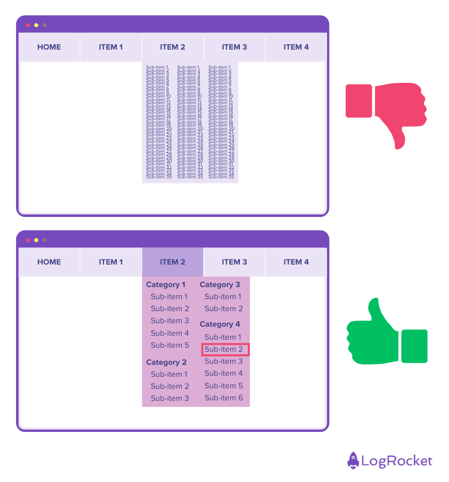
Mega menus can showcase your full product range without overwhelming users—if designed correctly.
Mega Menu Best Practices:
- Visual previews: Include product images in category sections
- Promotional spots: Highlight sales or new arrivals
- Quick links: Add “Shop All” options for each category
- Responsive design: Ensure mobile-friendly collapsible versions

4. Perfect Your Product Filtering System
Filters transform overwhelming product catalogs into manageable, targeted selections.
Filter Categories That Convert:
- Price range (with price distribution histogram)
- Brand (with product count indicators)
- Size/Color (with visual swatches)
- Customer ratings (4+ stars, 3+ stars, etc.)
- Availability (in stock, on sale)
- Product features (specific to your industry)
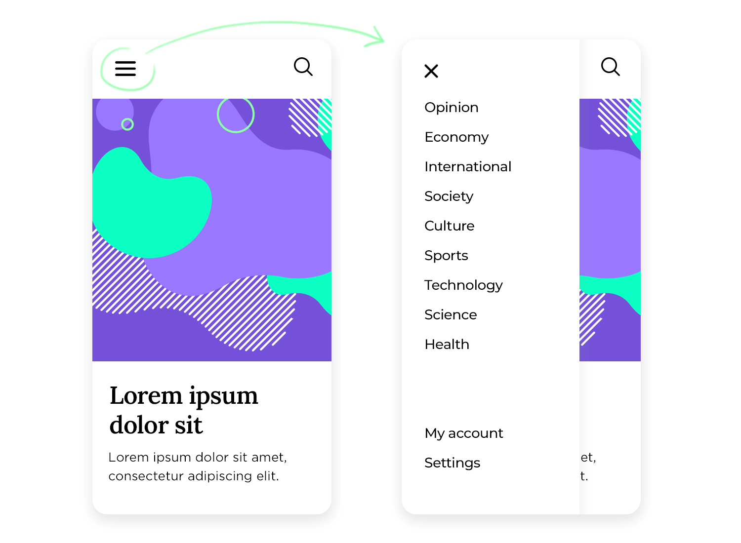
5. Optimize Mobile Navigation (It’s Not Optional)
With mobile commerce representing 54% of all e-commerce sales, your mobile navigation must be flawless.
Mobile Navigation Essentials:
- Hamburger menu with clear category labels
- Sticky search bar for constant access
- Touch-friendly buttons (minimum 44px)
- Swipe-enabled product galleries
- One-thumb navigation for ease of use

Advanced Navigation Strategies That Separate Winners from Losers
Breadcrumb Navigation: Your User’s GPS
Breadcrumbs reduce bounce rates by 10% and increase user confidence. Structure them as: Home > Category > Subcategory > Product
Smart Recommendations Engine
Implement “People who viewed this also looked at” and “Frequently bought together” sections to guide users toward complementary products.
Exit-Intent Navigation Optimization
When users move their cursor toward the browser’s close button, trigger a subtle overlay with:
- Popular categories
- Current promotions
- Customer support chat
Common Navigation Mistakes That Kill Conversions
❌ Too many top-level categories (causes decision paralysis)
❌ Generic category names (“Miscellaneous” or “Other”)
❌ Broken or slow-loading filters
❌ No clear path back to main categories
❌ Missing product count indicators in filters
Measuring Navigation Success: KPIs That Matter
Track these metrics to gauge your navigation’s effectiveness:
| Metric | Good | Excellent |
|---|---|---|
| Average session duration | 3-5 minutes | 5+ minutes |
| Pages per session | 4-6 pages | 6+ pages |
| Category page bounce rate | <40% | <25% |
| Search success rate | >80% | >90% |
| Mobile navigation engagement | >60% | >75% |
Your Next Steps: Implementing Navigation Excellence
Ready to transform your e-commerce navigation? Here’s your action plan:
- Audit your current navigation using heat mapping tools like Hotjar
- Analyze user behavior with Google Analytics’ Behavior Flow reports
- A/B test menu structures using tools like Optimizely
- Gather user feedback through on-site surveys
- Monitor and iterate based on performance data
Transform Your E-commerce Navigation Today
Exceptional navigation isn’t built overnight—it’s crafted through careful planning, user research, and continuous optimization. The strategies I’ve shared have helped our clients at Weblta increase their online revenue by an average of 40% within six months.
Remember: your navigation is your silent salesperson, working 24/7 to guide customers toward purchase. Invest in getting it right, and watch your conversion rates soar.
Ready to revolutionize your e-commerce navigation? Our team at Weblta specializes in creating conversion-optimized online stores that turn browsers into buyers. Schedule your free navigation audit today and discover how much revenue you’re leaving on the table.


